Case Study
ALYS | Brand Redesign
Unifying a personal growth platform under one grounded, nature-inspired identity.

View full page
Unifying a personal growth platform under one grounded, nature-inspired identity.

“My original site had grown into a universe of its own. Nobody knew how to navigate it, and switching pages felt like jumping between different businesses. I'd curated it all myself and had a designer build it, someone who never questioned my decisions, so I only realized afterwards how much real UI/UX understanding I'd been missing. With Alex the process was effortless. I sent him my rough Figma draft and shortly after he showed me what he'd built. I was stunned how fast he'd sharpened my idea and brought it to life. The biggest change is how confident I feel sharing my site now. And the feedback shifted from 'interesting website' to 'it feels like a home, like a forest you can walk through, everything is clear and easy to navigate.' I'm overjoyed and eternally grateful.”
Disclaimer
All text, names, prices, and product details shown in the mockups and screenshots are fictional and used for demonstration purposes only.
They do not represent real offerings, pricing, or business information of the client.
All visual content was created exclusively for the purpose of showcasing the design work within this case study.
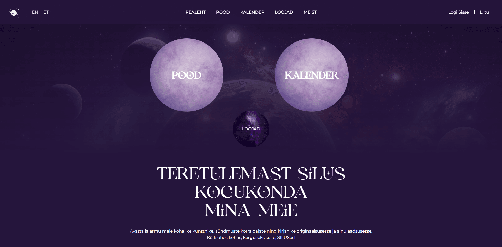
ALYS is a personal growth and mentoring platform from Estonia. Offering 1:1 sessions, group workshops, a curated shop and an educational blog. The founder wanted to reposition her brand: away from an ethereal, cosmic identity toward something warmer, more grounded, and more accessible.
The existing platform had grown organically. The landing page spoke a mystical, galaxy-inspired language. The shop used warm oranges and neon-gradient product borders, a completely different visual mood. Each section felt like a different brand.
The brief: unify everything under one identity that feels like a safe, approachable space for mental health and emotional support.
We replaced the cosmic palette with a nature-inspired system — deep forest greens, warm ivory, and soft earth tones. The visual language shifted from otherworldly escape to grounded presence.
A refined serif for headings paired with a clean serif for body text replaced the decorative display typography, gaining readability without losing character. Every page was restructured around clear hierarchy and intentional whitespace.
The result: one coherent brand across all touchpoints, landing page, services, shop, blog. Calm, clean and unmistakably ALYS.

It started with a rough wireframe the client had put together herself, a clear sign that the vision was already there. My job wasn’t to reinvent it. It was to refine, structure, and bring it to life.
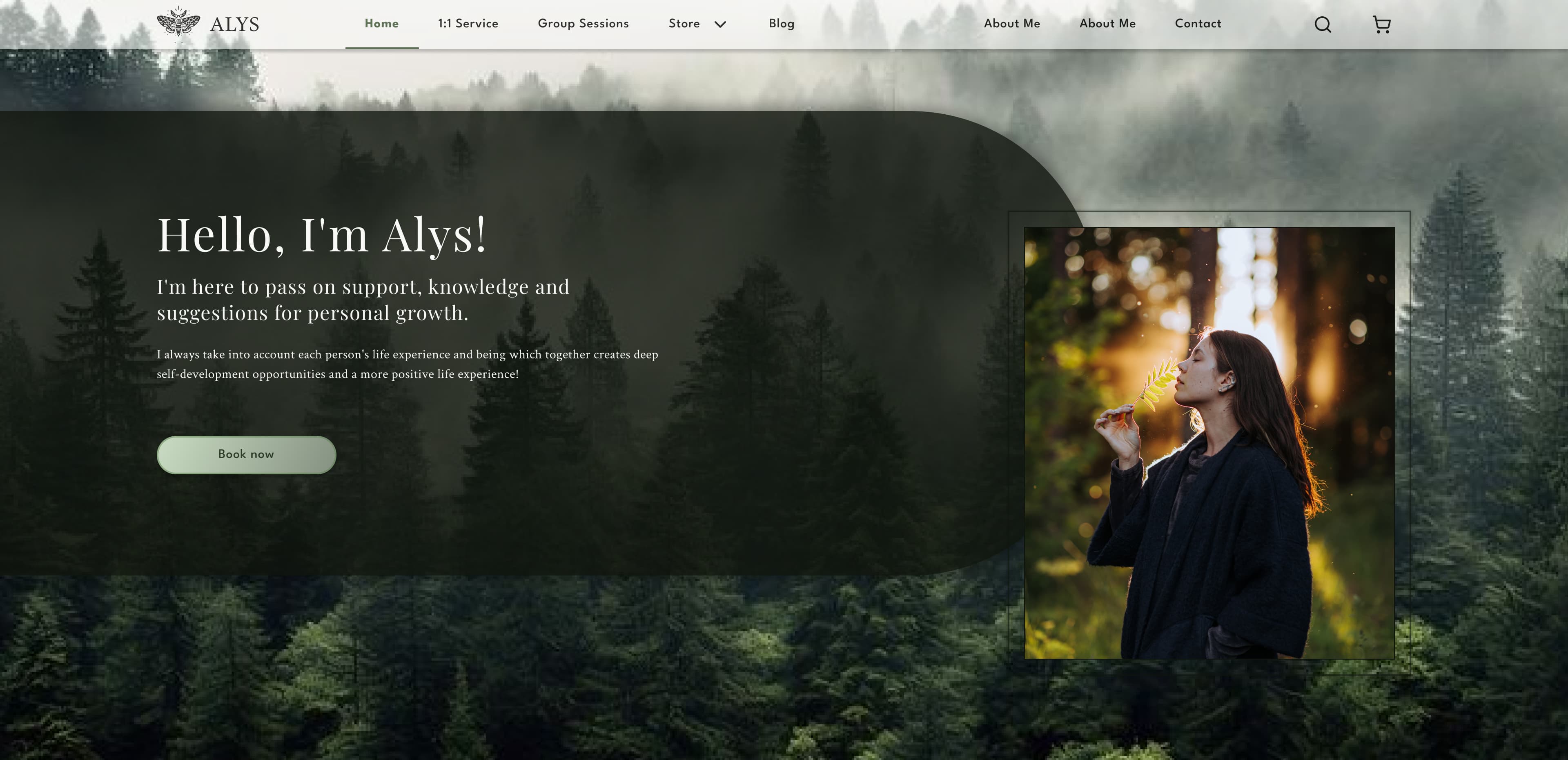
From cosmic immersion to grounded warmth. A clear hero, focused navigation, and a visual tone that invites rather than overwhelms.
The shop was the biggest disconnect. Warm oranges, neon product borders, and a decorative font that belonged to a different brand entirely. The redesign brought it in line: clean layout, consistent palette, and a shift from impulse-driven to curated discovery.
Restructured around a clear narrative: what it is, who it’s for, how it works. Cards and whitespace replaced dense text blocks.

Now an editorial extension of the brand. With category tags, reading time, and typography that matches the rest of the platform.


“Grounded presence, not cosmic escape.”
Typography
Primary — Playfair Display
Aa Bb Cc
RegularAa Bb Cc
ItalicAa Bb Cc
BoldSecondary — Crimson Text
Aa Bb Cc
RegularAa Bb Cc
ItalicAa Bb Cc
Semi-BoldButtons & CTAs — League Spartan
Aa Bb Cc
MediumType Scale
Color Palette
Base Colors
Neutrals
Deep forest greens anchor the identity. Warm neutrals keep it approachable. Burgundy, xanthous, and steel blue serve as signal colors for warnings, info, and alerts. League Spartan is used for buttons and CTAs.
The redesign unified every touchpoint under a single, cohesive visual identity.
What was previously different visual languages became one calm, grounded brand experience.
Let's turn your vision into an interface that works for your users and your business.